Are you struggling to get the results you want from your website?
Whether you're looking to increase conversions, improve engagement, or boost sales, A/B testing can help you achieve your goals.
In this article, we'll explore the benefits of A/B testing, best practices, and helpful tips to get started.
Let's dive in!
What is A/B Testing?
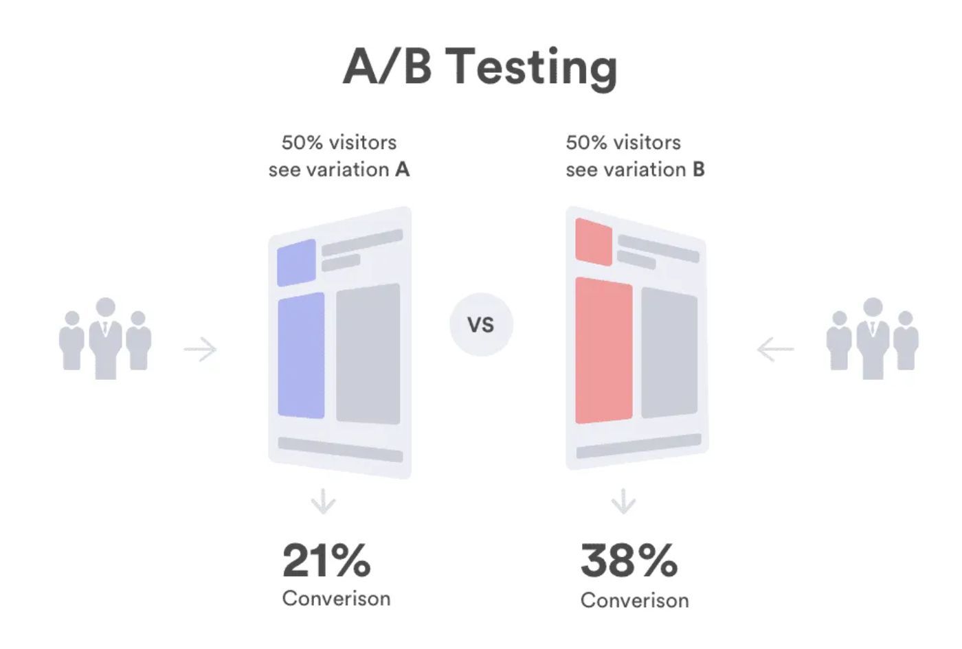
A/B testing, also known as split testing, involves comparing two versions of a web page or design to see which one performs better.
By analyzing user behavior and data, you can make informed decisions about what changes to make and how to optimize your website for success.
Sounds complicated?
Don't worry, it's not as complex as it seems.
We'll provide you with straightforward, easy-to-follow instructions. This way, you'll be able to boost your website's conversions effectively and effortlessly.

The process entails collecting data on a page or page element, replacing the design, and comparing the data.
In some cases, like paid social media ads, you can run them simultaneously, collecting both data sets in real-time.
However, if you want to assess the subscribe section or a call to action on your business's home page, you’ll have to collect information, make the change, then evaluate the changes.
A/B Testing Examples
We've outlined 3 common A/B testing use cases to improve your understanding of the concept.
Each focuses on a crucial part of a website that helps marketers generate conversions.
1. Hero Section
The top fold of your website influences every visitor's impression of your brand. As a result, the hero section is one of the most critical parts of your marketing.
To measure the effectiveness of your hero section design, you can monitor user engagement metrics such as the time spent on your website or the number of clicks on your call-to-action button.
For instance, tracking the clicks on your CTA near a specific illustration can give you insight into its effectiveness.

A/B test the following variations to ensure you get the most out of every web visitor.
- Image vs. Illustration – Test bounce rates on a static image and then an illustration.
- Image vs. Animated Illustration – Add an animated illustration to your hero section to catch the user's attention.
- Illustration vs. Lottie Animation – Test the user engagement with a Lottie animation. Your page load speeds should improve due to Lottie's small file size.

2. Call-to-Action Buttons
CTAs are the gateways to your sales funnels.
Therefore, A/B testing the areas that lead users to contact forms, product pages, or more information is vital.
You can test the following scenarios to ensure your buttons generate the engagement necessary to move visitors through the customer journey.
- No Icon vs. Static Icon
- Static Icon vs. Lottie Animated Icon
- Animated Icon Colors (Red vs. Blue)
- Test the animation triggers (Animate on Loop vs. On-Hover)
3. Experimenting with Lottie Animations
As a rule, an animation should outperform a static illustration, but you can maximize the section by improving the animation.
For example, you can test the following Lottie animation parameters:
- Colors – Try different colors to increase engagement.
- Speed – Subtle animations are typically favored by users, but collecting user data is the only way to find the best option.
- Trigger – Optimize how users interact with the Lottie animation. Try on-hover vs. loop, loop vs. loop on-hover, loop vs. morph, etc.
- Size – Increase or decrease the size to see if engagement rates change.
- Design – You can also test a completely different Lottie animation to see how users interact.
Interactions
Interactive animations can be applied to any section of your website. You can implement the trigger on the hero, buttons, forms, and key selling points.
For example, if your hero section performs better with a Lottie animation than a static image, A/B test the animation on a loop vs. on-hover.
Typically, users respond to interactive page elements.
A study from Being Seen Matters found that hover outperformed clicks in correlation to on-page conversions.
Finding the Optimal Combination Of Animated Elements
While animation will deliver better conversion rates, the best approach is not to overwhelm the user.
A home page with over 10 Lottie animations could be distracting and may not provide the best user experience.
Finding the right amount of animation on a page can also be accomplished through A/B testing. You can experiment with different combinations of static and Lottie designs.
For example, you can try a large on-hover animated illustration in your hero section with animated call-to-action buttons but keep the rest of your page static.
How to A/B Test Web Designs in 6 Easy Steps
Follow these steps, and you can test any page element to ensure you are maximizing the potential of your audience.
Step 1: Define the design element and your goal
Before you start A/B testing, identify the design element you want to improve and set a clear goal.
For example, if you want to increase click-through rates on your call-to-action (CTA) button, your goal might be to change the color, increase the button's size, or include an animated icon.
Step 2: Create a hypothesis
Once you've defined your goal, create a hypothesis about how changing the design element will impact user behavior.
For example, you might hypothesize that a red CTA animation will outperform an existing black static CTA; an experiment conducted by HubSpot confirmed the idea that red and orange lead to more conversions.
The marketing agency based the hypothesis on 2,000 website visits and found that the red CTA button outperformed the green CTA button by 21%
Step 3: Create a new variation of your design
Using your hypothesis, create a new variation of your design.
For example, create a new CTA button with a red animated design to test against the existing black static CTA.
Step 4: Run tests
To measure the effectiveness of your new design, run tests using social media analytics, landing page metrics, or other relevant data points.
For the best results, test both versions of the design simultaneously and with the same audience if possible.
Step 5: Analyze metrics
Once you've collected enough data, analyze the metrics to see which design version performed better.
Look for statistically significant differences in user behavior and take notes of any insights or patterns that emerge.
Step 6: Repeat
Based on your analysis, make any necessary changes to your design and run additional A/B tests to continue improving your results.
For example, you can change the color, trigger, speed, size, design, position, or any other variable to see how it impacts user behavior.
Always set clear goals and hypotheses before each test to ensure you're making data-driven decisions.
Tips for A/B Testing
We recommend testing every element of your website, digital ad, or application that requires user interaction.
Doing so allows you to take advantage of analytics and make data-informed decisions. Below are some tips to keep in mind when A/B testing your designs.
- Keep it simple: Focus on testing one design element at a time to avoid muddying your results with multiple variables. For example, if you're testing a CTA button, focus solely on changes to the button's color, size, or placement.
- Test with sufficient sample size: It's essential to have a large enough sample size to ensure your results are statistically significant. Aim for at least 100 conversions per variant to achieve reliable results.
- Spend adequate time looking over analytics: Don't rush to make changes based on early results. Spend time reviewing your analytics and testing multiple times to ensure you're making informed decisions.
- Keep track of your results: Keep a log of your A/B testing results to track your progress and learn from your findings. This will help you identify trends over time and better inform future testing.
- Test on different devices and browsers: Ensure that your A/B testing is performed on various devices and browsers to determine how users respond in different environments.
- Have a control: Always have a control version of your design to compare against. This will ensure that your A/B test measures the impact of your changes rather than random fluctuations.
Remember, A/B testing is an ongoing process. Continuously analyze your results and make incremental changes to your designs to improve your results continually.
Final Words
A/B testing is a fundamental part of digital advertising. If you aren’t using data to evaluate the most vital aspects of your designs, you aren’t taking advantage of technology and won’t see improvements. Testing your web pages, apps, or digital ads allows you to remove the guesswork from marketing and make decisions based on data.
If you are interested in testing your static designs against Lottie animations, check out the Creattie library. Browse thousands of assets and make customizations directly from the platform.


