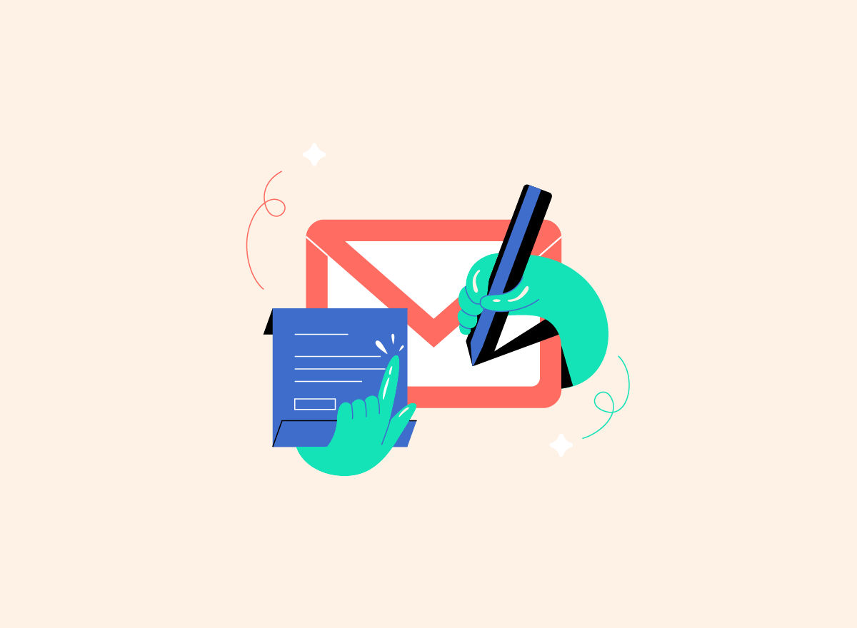
Animated email icons are an effective way to incentivize users to connect with your business. In this post, we will demonstrate why you should implement animation to your contact icons and provide actionable examples.
Why You Need an Animated Email Icon
Adding motion to your email icons can dramatically improve your lead generation efforts. Whether selling products directly from your webpage or providing services, you can benefit from increasing interactions with visitors.
Incentivize Engagement
Animation has been scientifically proven to increase engagement on web pages. Adding subtle motion graphic elements will keep users on your pages longer and increase conversion rates.
If you'd like to know more about the science behind animation on web pages, check out our full article breaking down a study by researchers from The Hong Kong University of Science and Technology.
More Leads
A full inbox is never a bad thing for a growing business. Adding an animated email icon to your contact points will attract users' attention.
Create Unique Pages
Animation supports your broader goal of building web pages that stand out from other businesses in your niche. Subtle animated elements provide users with a fresh online experience.
Things to Avoid When Using Animation
Incorporating animation into your designs can help improve the UI and UX at a low cost; however, you need to be careful not to turn off visitors.
Too much animation can be overwhelming. We highly recommend subtle movements and keeping the animation minimum per page section. One way to keep motion from overstimulating is to use 'loop-on-hover' so the animation will only run when users engage.
We also recommend using designs that are in the same style; this ensures your page elements flow and are cohesive.
You want to choose non-intrusive designs with minimal movement created in the same style. As a result, the email icon is the perfect place to include animation.
Animated Email Use Cases
You obviously don't want to randomly place email icons throughout your website, but there are many options that make sense. Below are the most common 4 ways to use an animated email icon.
Header/Footer
Icons in menus break up content and communicate with the user without using words. For example, an animated email icon next to your 'contact' button can liven up headers and footers.
Subscribe Section
Requesting the user's email is one of the main goals of many web pages. You can incentivize them to enter personal information by including animation in your subscribe section.
Contact Page
A contact page is a great place to add an animated email icon. You can even use a large email design as the main page element to compliment the form (Lottie animations are vector, so they won't lose quality if they are scaled up.)
Notification
Say you have a chatbot on your site; you can use an animated email icon to communicate the tool to users needing instant help.
Animated Email Design Examples
Below are 5 ready to use Lottie email icons. We'll break down each's style and give some tips on how to use them.
Minimalistic Email Icon
Our first example is a simple, timeless design that can be used in various situations. You can use it as a notification or page element. Try the inverse for a dark theme look, or bring down the stroke width for a sleek, modern style.
@ Icon
The @ sign icon is an inviting design that immediately captures users' attention. It is an excellent option for subscribe sections and contact pages.
Send Email Icon
One of the reasons you should use animation is to instill confidence. For example, the Send Email icon indicates that when the user sends a message, it will be received, and they will get a reply from someone in the organization.
Mail Notification Icon
The Mail Notification is another minimalistic icon designed in the same style as our first example. These can be used together on web pages serving individual purposes but keeping the design cohesive. For example, you can use animated communication icons on your menus, contact page, and subscribe section, then use the Mail Notification to notify users they have a message.
Envelope with Letter
A received icon is great to have in your tool belt. The Envelope with Letter icon is the perfect option. You can use the design on your contact pages to confirm the user's message has been sent.
Why Use Lottie Icons?
Lottie is the best format to implement web page animations. JSON provides multiple advantages that help designers and improve the user experience.
Easy to Implement
Lottie animations can be used on every CMS platform and added directly to HTML. If you need some help implementing Lottie animations into HTML check out our posts on the Creattie blog.
Smaller than other Formats
File size has limited the practicality of web page animation for decades. We all know that animation increases engagement, but you won't convert visitors if page load speeds are slowed to a crawl.
Lottie is exponentially smaller than GIF, SVG, and MP4, so you can use as many as you want! Just make sure you don't go overboard.
Vector Artwork
JSON animations are built with vectors rather than pixels. Vector animations are sized with mathematical values rather than stored pixels.
Final Words
Ready to start using Lottie animations to get more leads? Head over to Creattie to browse the entire library. You'll find dozens of email icons along with other essential UI page elements, illustrations, and other animations powered by Lottie.


